Jasper Connections
Bellingham
2024
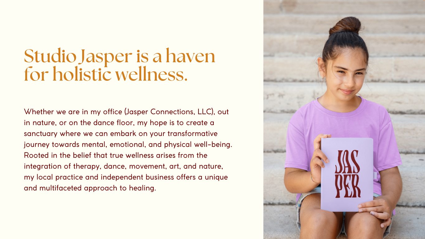
Jasper Connections is a therapeutic practice, rooted in creativity, somatics, and relational healing. Serving individuals, families, and communities, the practice integrates expressive arts, eco-therapy, and nervous system regulation to help clients feel safer in their bodies, reconnect with themselves, and deepen relationships.
Brief
We to built a full brand identity and website for Jasper Connections. The scope included a visual system (logo, colors, typography, iconography), brand messaging aligned with Jasper’s unique therapeutic approach, and a responsive website that reflects the warmth, creativity, and depth of their work.
Challenge
Jasper’s therapeutic approach is deeply relational, creative, and intersectional. The challenge was to translate those intangible qualities (safety, authenticity, embodiment) into a visual and digital presence. Their practice needed a brand that felt accessible yet soulful, professional yet energetic and expressive. The website had to guide potential clients to understand their modalities (somatic, eco, expressive arts) and book consultations, while maintaining clarity and emotional resonance.
Solution
We created a brand identity built around organic forms and gentle geometry; visual metaphors for connection, flow, and grounding. The logo, color palette, and typography evoke openness and creative movement. For the website, we focused on intuitive navigation, emotional storytelling, and conversion paths (e.g. free consult, service pages). Copy was refined to reflect the company’s voice and values. The site was made responsive and optimized to support both clarity across devices.
Key Features
Brand Strategy
Positioning built around relational healing, creative expression, and nervous system regulation; emphasizing authenticity, equity, and embodied wellness.
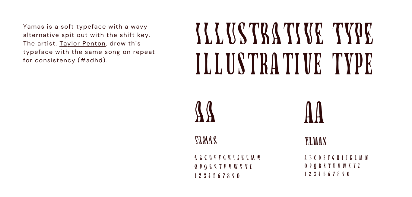
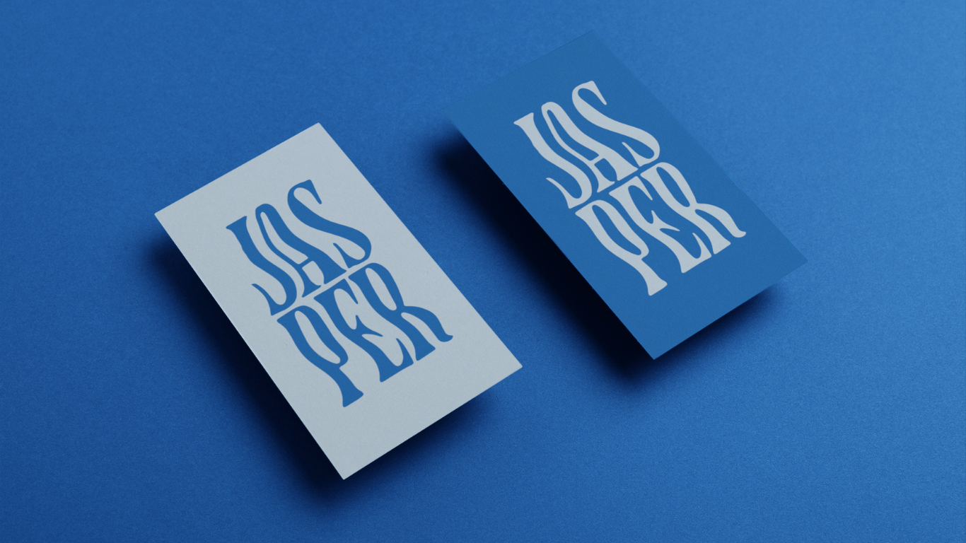
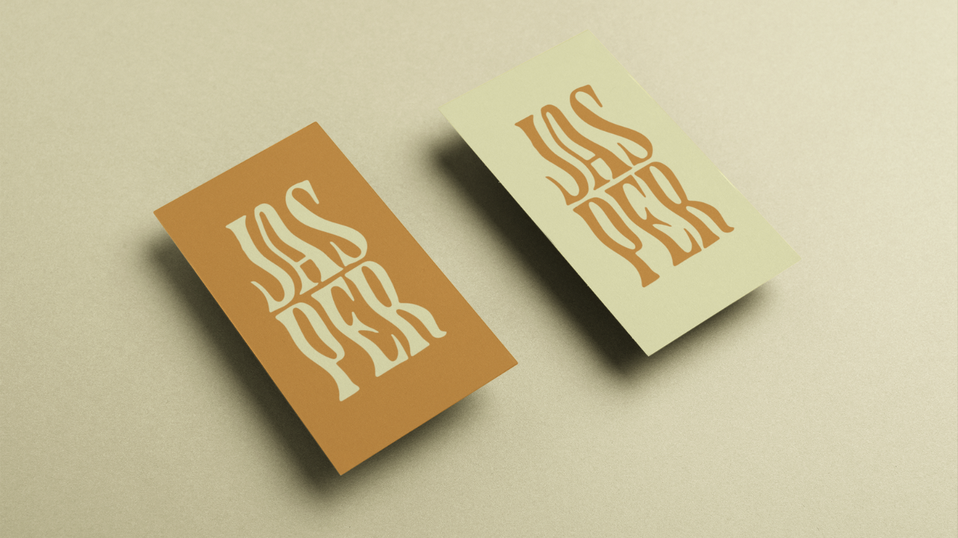
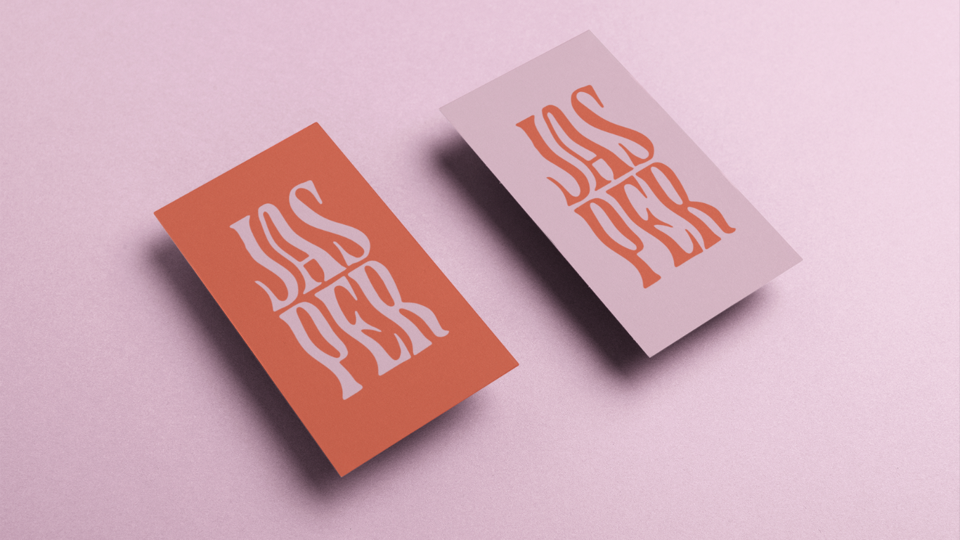
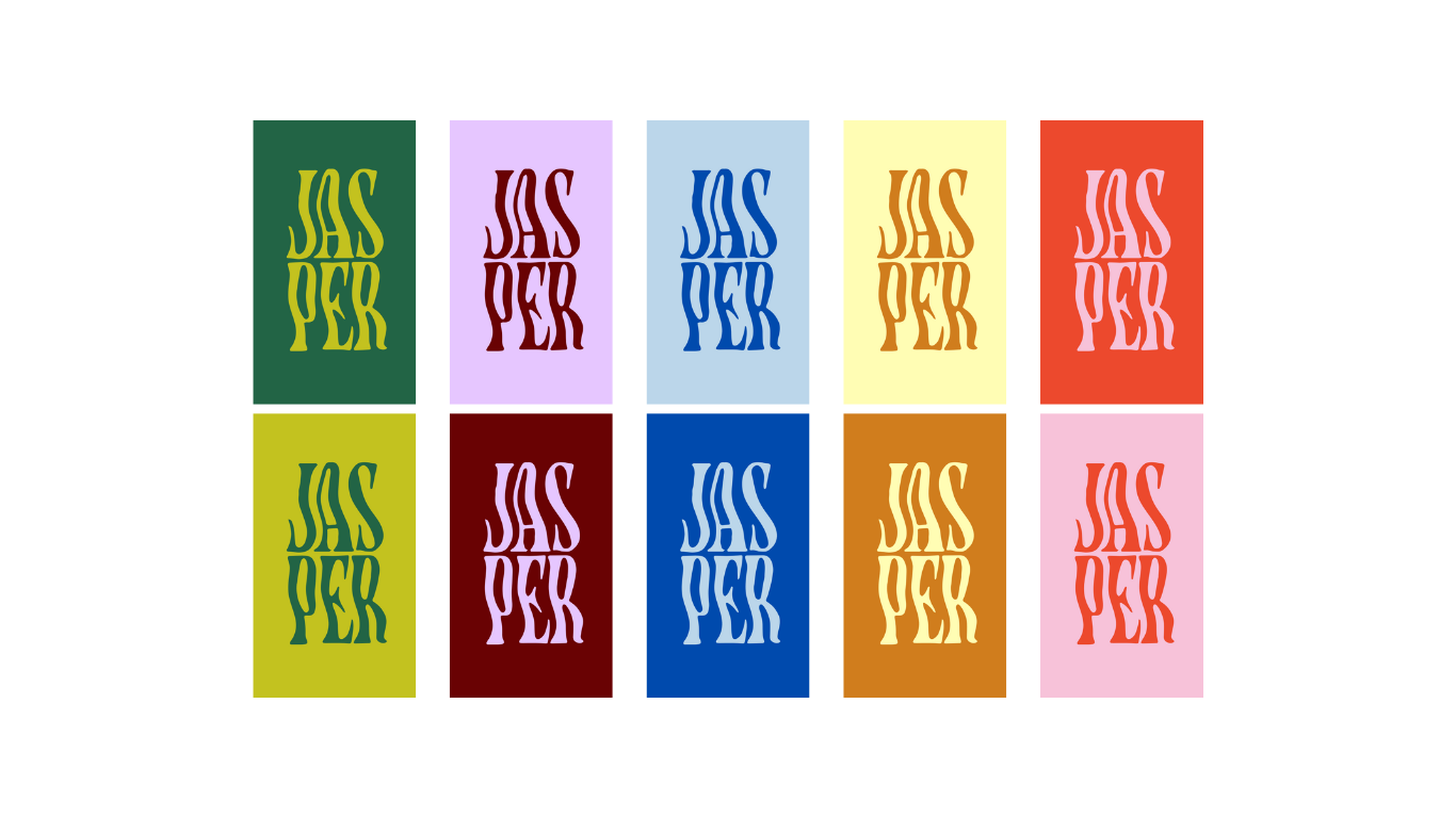
Visual Identity
Custom logo and symbol that suggest flow, support, and connection; graphic motifs that echo organic movement.
Color & Typography
A calming, grounded palette complemented by soft accent tones; typefaces chosen for accessibility.
Messaging & Voice
Rewritten site copy that centers the practitioner’s lived experience and therapeutic philosophy.
Website UX / UI
Service pages, consult funnel, emotional storytelling, and intuitive navigation to support trust-building.
Responsive Design
Mobile-first layout ensuring that image, text overlays, and call-to-action buttons remain legible and engaging on small screens.
Outcome
The result is a brand and website that embody the heart of Jasper Connections: creative, grounded, and transformative. The brand now presents a coherent and compassionate visual presence; one that invites connection, holds space, and clearly guides new clients toward healing pathways.